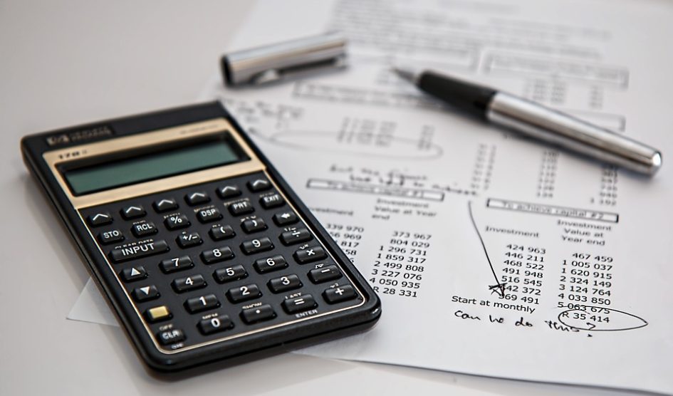
With so many beautiful PowerPoint templates available online, it can be a tough job to select one. It is very easy to get swayed away by the multitude of choices. However, you can’t afford to make a mistake when you are putting together a presentation for your company or your brand, especially when you are operating in the finance sector. A wrongly selected template design can lead to catastrophic results in some cases.
Mistakes To Avoid When Selecting Template
So, what are the common mistakes that you should avoid when you are selecting finance PowerPoint presentation templates?
-
Mistake 1: Selecting Wrong Colour
There are many finance PowerPoint templates available online with different colour schemes and combinations. But not all of them are going to be  aligned to you and represent you. You need to understand what image you want to portray in front of your audience.
If you are going to represent your brand or your company then you should ideally stick to the branding guidelines and use the template that has your logo’s colours. If you are going to be speaking at a conference as an individual or a professional from finance segment then you can do away with the brand colours. But this does not mean you can choose the more vibrant colours. Use colour shades that make you look mature and well learned. If you do not come across as a specialist or an expert then people may not want to listen to you.
-
Mistake 2: Selecting Wrong Layout
Another common mistake that people often make is that they select a wrong layout in their efforts to select the best finance PowerPoint templates. Although it may not seem that important layouts often make a big difference in presentations.
The layout of the template should be selected based on the presentation style of the person. If you are going to be seated in a boardroom, then it makes sense to have a moderately busy layout. But if you are going to present using web conferencing platform then you can opt for a busy layout. In such a case, the only thing that you audience will see if the deck itself and nothing more. You won’t get a chance to establish eye contact or use body language in this case to connect with your audience. So, a busy layout will be ideal to share as much information as possible.
However, if the presentation is going to be conducted on a large stage in front of live audience then you can use a minimalist layout. In such cases, it is the presenter who woos the audience. Your deck should have bare minimum information on it so that the audience can focus on the person. Less is more in such cases.
-
Mistake 3: Selecting Wrong Font Typeface
The type of font that you use in your ppt finance is also important. There are different types of fonts available online and each font has a certain type 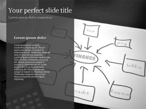 of image associated with it. Since you are going to be presenting to professionals from finance world, you can’t opt for a font that makes you look casual. The whole demeanour of your presentation has to be professional and mature. For such cases, you should always opt for the more corporate style of fonts like Arial or Calibri or even Georgia. These fonts would help you create a corporate and professional image. If you end up using the handwritten type of fonts or designer fonts like Comic San, then you may end up creating an impression of a casual person which would not be appreciated.
-
Mistake 4: Using Wrong Font Size
The size of the font that you use also matters a lot in any presentation. Using bigger sized fonts with bold style is not appreciated or recommended in the finance industry. Such fonts often make the person look very strong headed and reinforcing. Such strong personality representation can make others wary of you.
However, using a very small font size is also not advised because it is often associated with fine print. It may appear as if you are trying to hide something and are just being sly about it.
So, think carefully before you finalize the font size and the styling of the font.
-
Mistake 5: Making it Too Wordy or Too Image Based
The key to making any presentation a big success is the balance that you are able to maintain between text and images. A lot of people feel that just  because they have got a lot to say it should all come down on the presentation deck. This ends up making the presentation text heavy. Such decks are often considered to be boring.
Similarly, if you add a lot of images to the deck, then you risk being looked upon as a person who is not well versed with finance.
So, it is important to maintain a fine balance between text and image in the deck.
-
Mistake 6: Making it Very Lengthy
A good presentation does not always have to have a lot of slides. Your audience will have an attention span of hardly 40 minutes. In these 40 minutes, you should not be bombarding them with multiple slides. They are not going to be able to grasp it.
Instead, what you can do is try to minimize the number of slides that go in your presentation. This will give you enough time to elaborate on each slide and not have the audience lose its patience and attention.
Conclusion
Using a template is not going to make your presentation successful if you are not prepared with your talking points. What you say also matters a lot along with the presentation slides. So, check the entire presentation before you put it up for your audience. This will give you enough time to revisit your talking points for each slide as well as cross check every single slide that will come up.
Leave a Reply